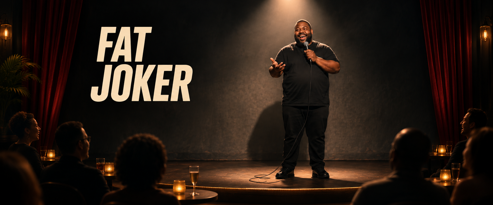
Fat Joker: AI Comedy
A fictional comedian brought to life through character development, voice direction, sound design, and video editing.
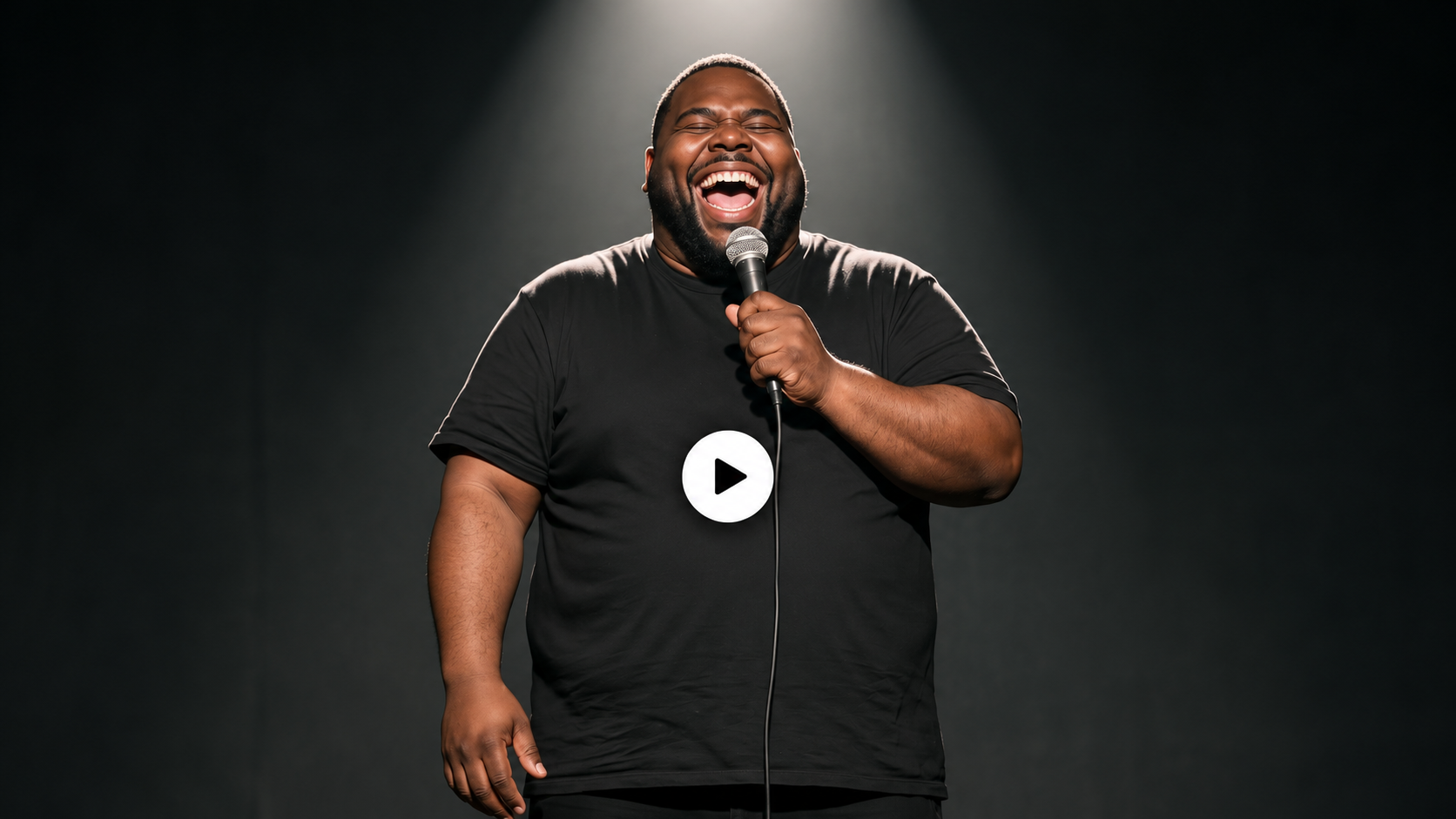
Watch the finished short
A comedy performance combining character animation, voice direction, sound design and captions designed for YouTube Shorts.
Creating the character
I designed Fat Joker to feel warm, expressive, and approachable, shaping his smile, vocal tone, gestures, and comedic delivery around that intention. The character references established his black wardrobe, microphone, and stage presence across multiple views. My visual goal was hyperrealistic skin texture and a lifelike appearance.
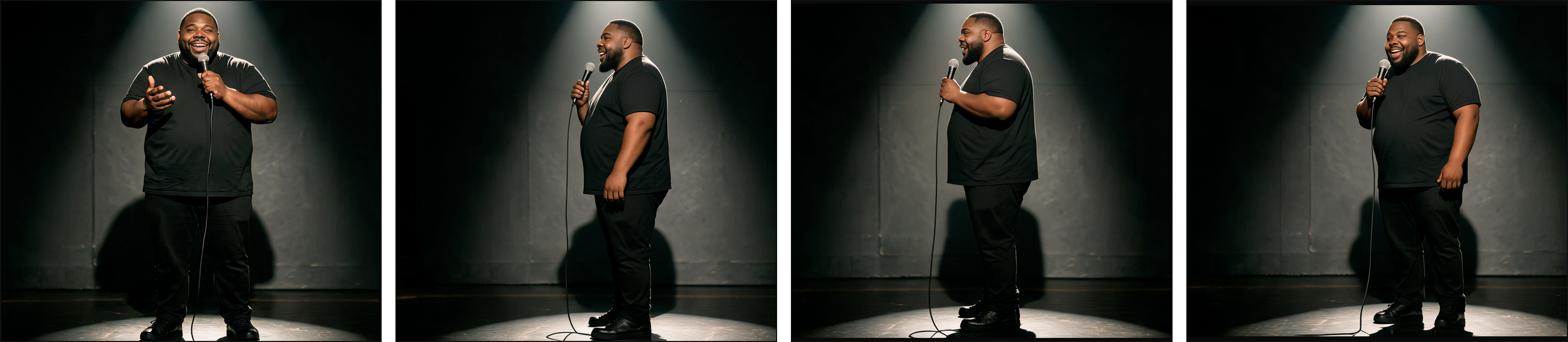
Fat Joker Character Views
DEVELOPING THE VOICE
I developed Fat Joker’s voice in ElevenLabs with a detailed prompt defining his warmth, Oakland influence, deep resonance, and playful delivery. Pauses, chuckles, and shifts in inflection helped shape his comedic timing.
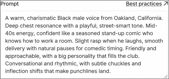
Fat Joker Voice Prompt

Fat Joker Script Delivery
BUILDING THE COMEDY CLUB ATMOSPHERE
In Adobe Audition, I layered the vocal performance with audience laughter, applause, and room tone. I staggered the laughter and clapping around the joke, using overlapping clips and fades to shape the crowd response while keeping the dialogue clear.

Fat Joker Audition Multitrack
Bringing the character to life
I supplied the character reference and prepared audio mix to Seedance through Higgsfield. My prompts directed expressions, gestures, punchline delivery and reactions during audience pauses.
I refined the performance instructions across iterations, specifying when the character should stop speaking, smile, nod and let the audience react. I reviewed successive takes for pronunciation, timing, audience interaction and framing.
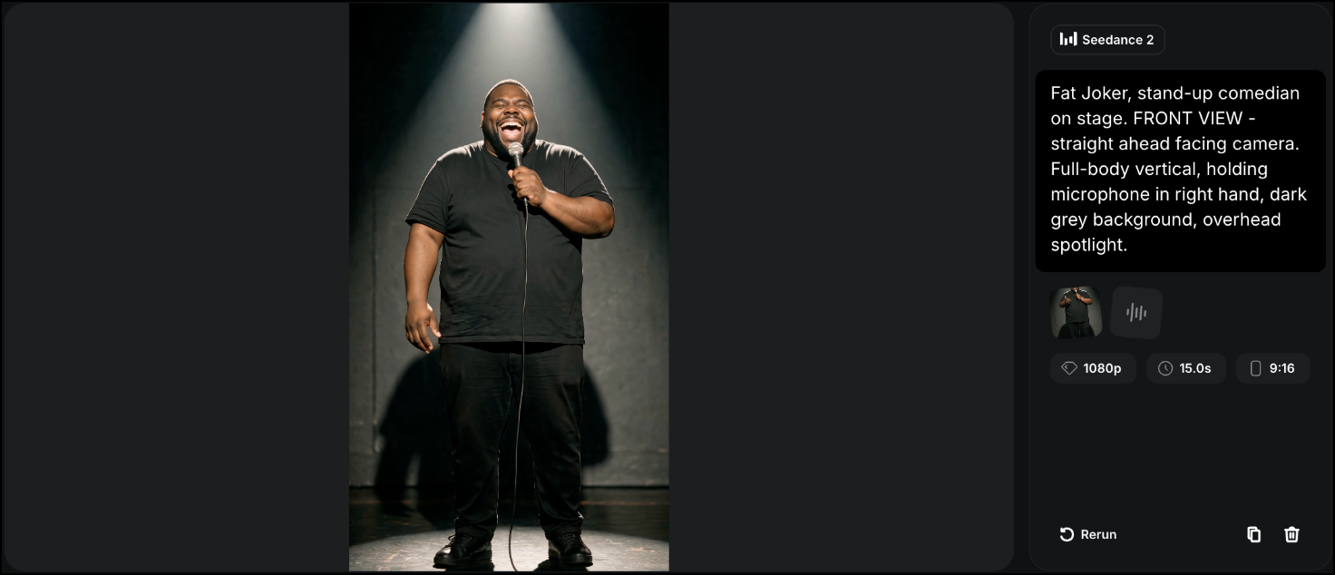
Higgsfield Selected Generation
Selecting the final take
I initially selected a performance that moved into a tighter crop toward the ending. I later chose a version with more consistent full-body framing to preserve the character’s gestures and stage presence through the punchline and closing laugh.
Both frames below show the takes at 14 seconds. The initial selection is on the left; the final selection is on the right.
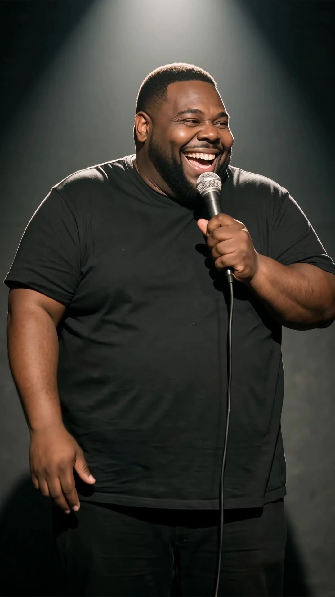
Initial Selection 14s
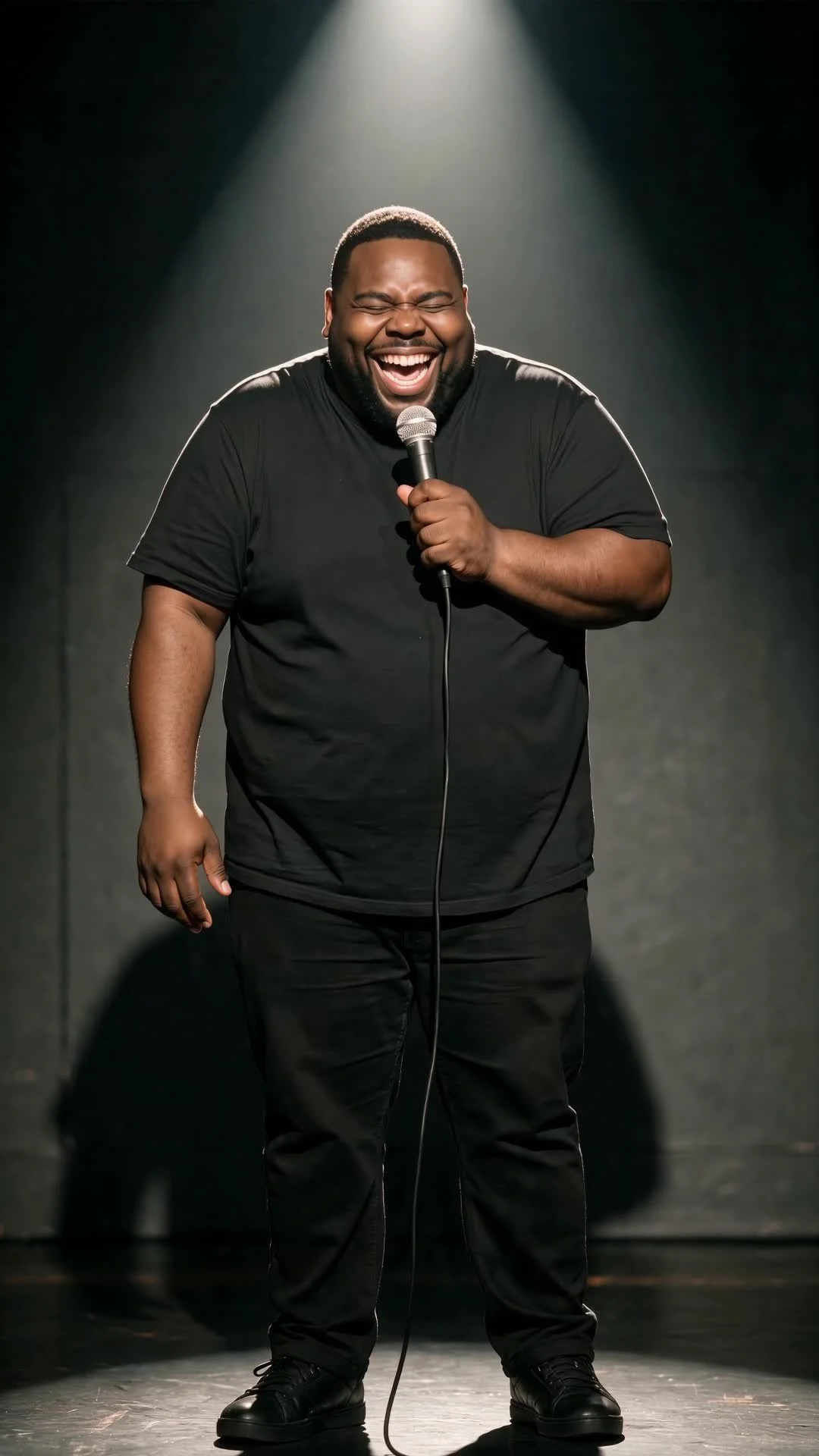
Final Selection 14s
Designing for YouTube Shorts
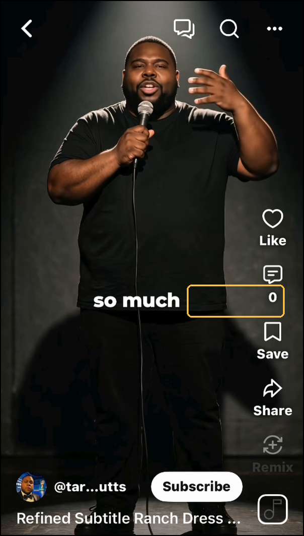
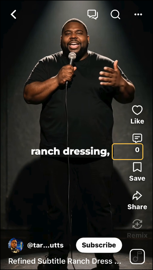
I tested the uploaded Short on an iPhone 17 Pro using a separate viewing account. One long caption sat too close to the comment count, so I split it into “so much” and “ranch dressing,” then checked the revised spacing inside YouTube Shorts.
I kept the captions to one line, grouped words into short phrases and used consistent typography with a dark shadow to separate the white text from the image. The annotated screenshots show the original grouping followed by the two revised captions. These observations reflect the device and interface tested, rather than a universal safe zone.
I also uploaded a reviewed SRT file for viewers using YouTube’s caption controls. The burned-in text remains visible when native captions are off; enabling a native track adds another text layer.
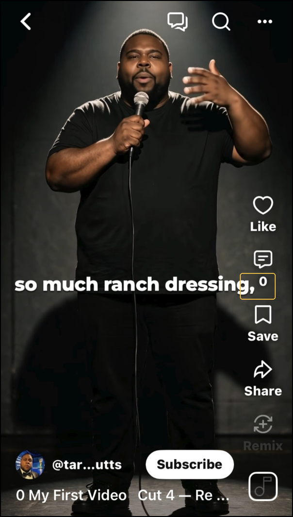
Caption Before
Caption After So Much
Caption After Ranch Dressing
Framing in motion
Initial selection on the left. Final selection on the right. Silent comparison.
What I learned
Creating a believable character required attention to the whole performance: voice, pronunciation, gestures, audience reactions and framing. A visually strong take could still fall short if a word was unclear or the camera movement distracted from the delivery.
Testing inside YouTube Shorts also revealed a spacing issue I had not identified in the editing view. That reinforced my approach to accessibility: consider it throughout production and evaluate the experience where people will actually watch.
For future shorts, I’ll establish pronunciation checks, performance criteria and platform caption tests earlier in production.